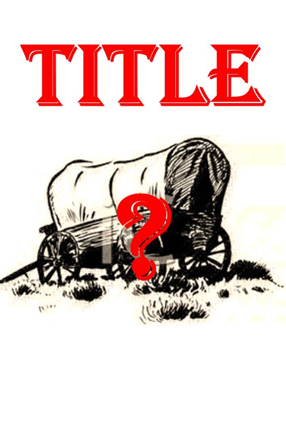
As I’ve written, I am hard at work this year editing my historical novel about travel along the Oregon Trail. I’m far enough along that I can envision its potential publication. So recently I started thinking about what I’d like the book cover to look like.
I have some experience working with a group of local authors (we call ourselves Write Brain Trust) on publishing issues. Write Brain Trust members have talked a lot about book covers, and we’ve helped each other on covers and other design issues with the books we’ve self-published.
 But more knowledge is generally a good thing, so I recently attended a program on cover design at The Story Center (part of the Mid-Continent Public Library in the Kansas City area). The presenter was Aaron Barnhart, a partner at Quindaro Press.
His advice was that a book cover needs
- One piece of art (which can be created from several elements)
- Two fonts (no more or the cover looks too busy)
- Three key elements
- knowing your key audience so you design the book to appeal to them
- a title . . . and a subtitle if desired
- a very short description of the book for your back cover text
I’m working on all these aspects of my book cover now. (Actually, I have a working title that I’m almost certain to use, but I’m not telling yet.)
I’m not an artist nor a designer, but I know my book, and I want input into the cover design.
I’ve been frustrated in working with most of the cover images I’ve considered. Line drawings (like the wagon above) seem dated and simplistic. Paintings don’t quite portray the scenes or characters in my book, and I have to worry about copyright issues. Photographs are even more likely to have copyright issues, unless I take the picture myself, and I only have a couple of my own photos I think might work.
At this point, I’m working with a variety of images, as well as trying to decide whether to use a tag line (like a subtitle) on the cover. And, of course, writing two paragraphs of back cover text is as hard as writing two full chapters of the novel . . . maybe harder.
More information to follow . . . no cover reveal yet!


I never realized so much thought needs to go into cover design but, as I think about it, a cover and title are often what first draws me to a book. I find photos such as those done during the Depression era by Dorothea Lange especially compellling because of the very human side of the story a picture can tell. But I realize that photos from the era you are writing about are much more rare and that there are copyright issues. Nonetheless, that would be how I would vote if you took one.
Thanks, Mary. Unfortunately, my best personal photo is of a covered wagon. It’s pretty accurate historically, but doesn’t show much human drama. This is definitely a work in progress!
Theresa
I agree with the difficulty in writing back cover text, Theresa. Good luck with your cover design…you’ll find the right one/
I like the idea of the covered wagon but would probably like to see a character or a shadow of people in the wagon. You would not need facial details so it could ‘cover’ any sort of imagination the reader uses to picture the true life stories you share in your book.